Overview
Prodigy was created in opposition to the multitude of passive learning programs aimed at young children and infants. Arming myself with the knowledge that the most important thing for a child's development was interaction with their parents Prodigy crossed swords with popular programs like Baby Einstein, Muzzy, and Nuryl.
How to structure such an application? How to build a program from the ground up around such a philosophy? That was the aim of this project.
Problem Statement
From the research I found that many current and future parents have interest in teaching music to their children, but most adults do not have the skills themself to teach to their children. It's also shown that young children learn best from interacting with their parents (as opposed to TV, games, audio tapes, etc).
Solution
Create an app that teaches parents (in simple, layman's terms) the basic of music so that they can put away the phone and teach them to their children directly.
This soluton is based on the idea that the most important part of children's learning is person-to-person interaction. Normally this means parent-to-child. Additionly, there are windows of time in a child's development that close rapidly and once closed never open again (i.e. perfect pitch). Finally, it is based on the idea that although music is more ubiquitous than ever before there are fewer and fewer musicians. Look how many free upright pianos are being given away on Craigslist. That used to be the iPod of the day, but nobody plays it anymore. Thus there are fewer people able to pass along those skills to their children.
To get started and get into the right mindset, let's do a little storyboard...

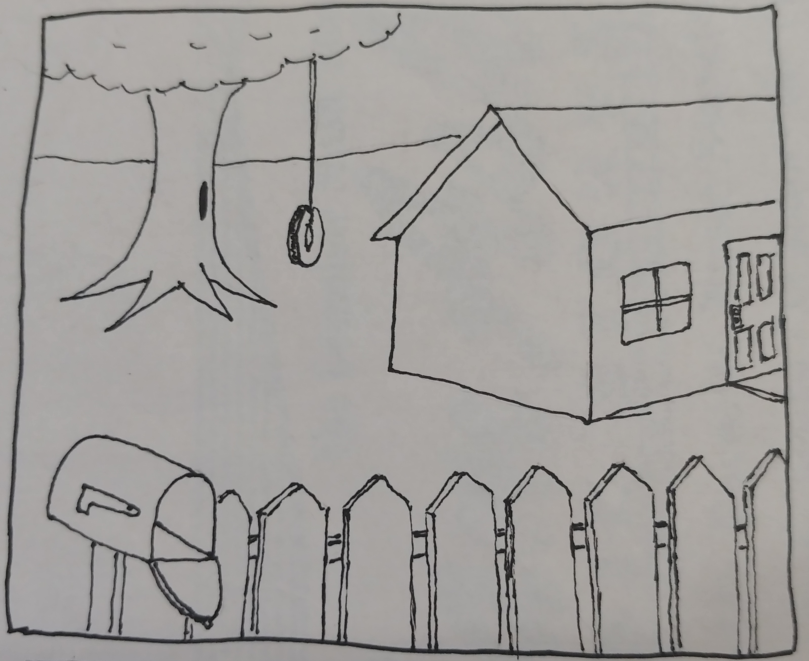
So we have here a house in the suburbs. The white picket fence, the tire swing in the back yard...

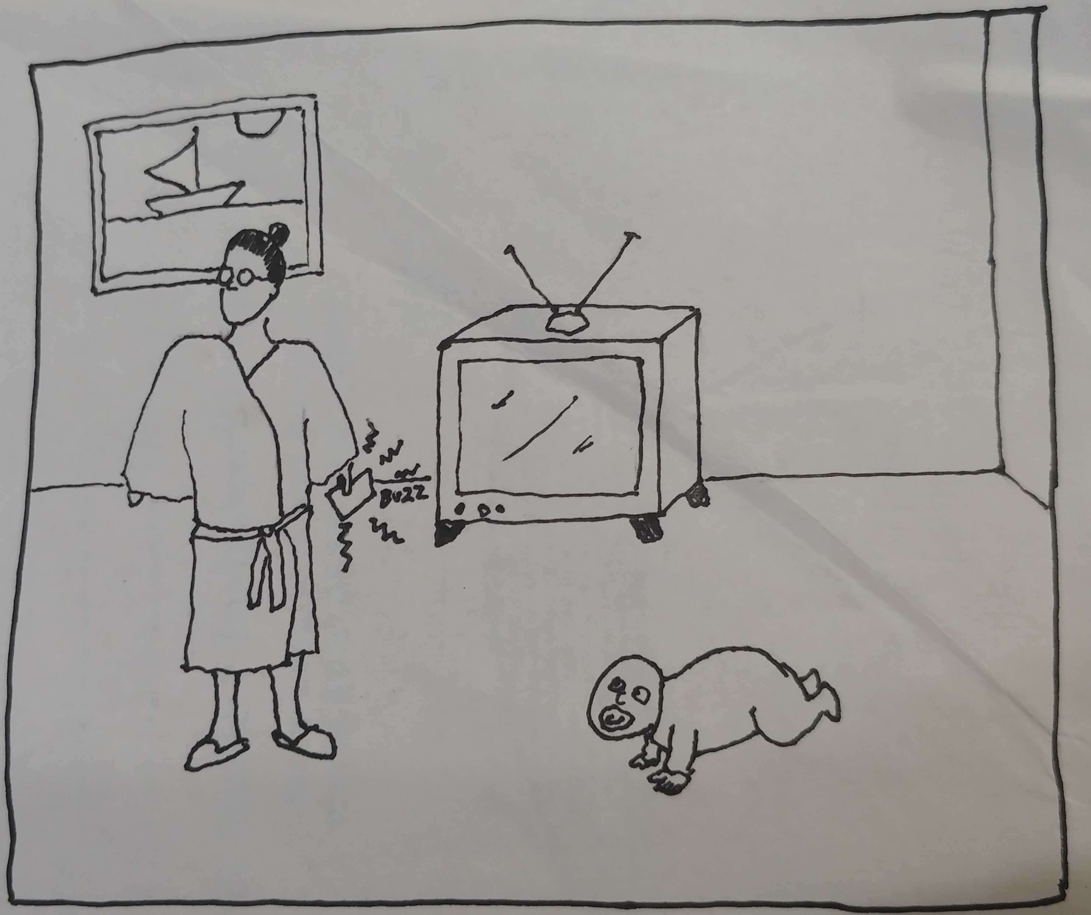
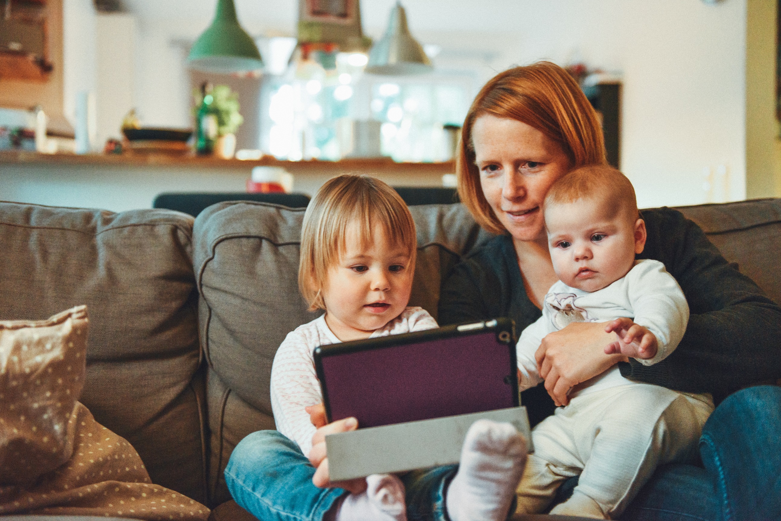
...and inside is a new mom and her baby.

She gets a notification on her phone asking if she's got a few minutes to complete today's activity

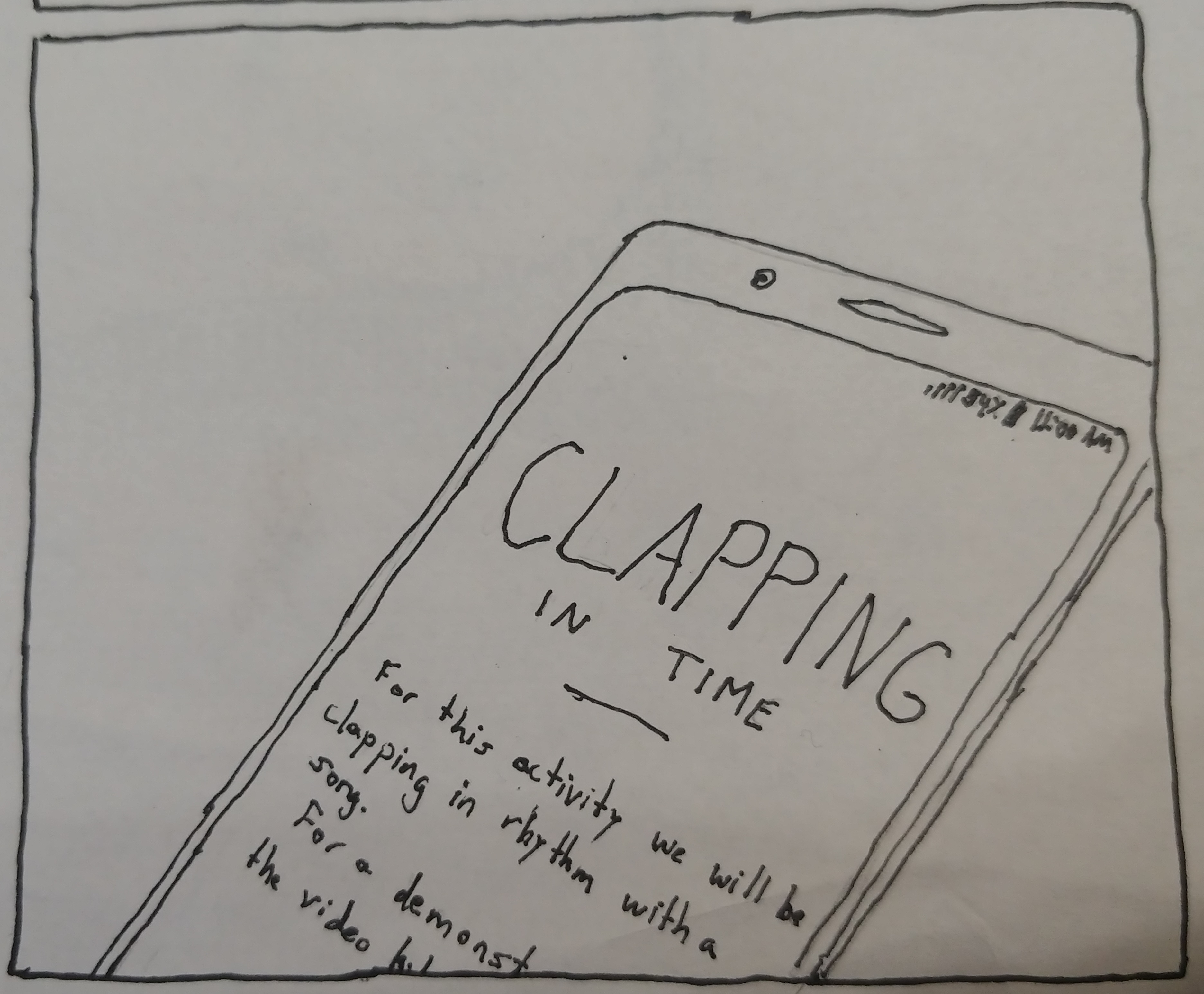
She does, so she starts the lesson. It's about clapping in time.

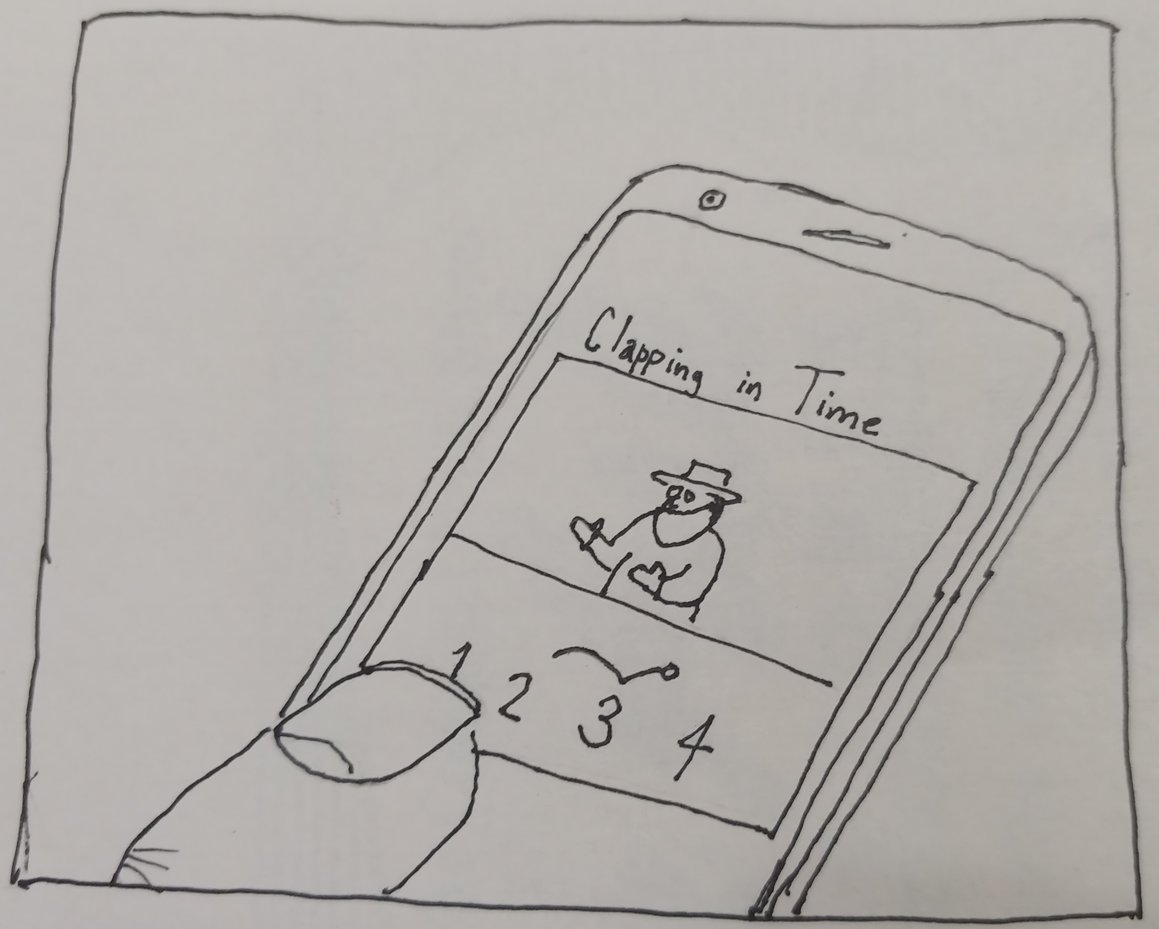
She reads what she's doing, she watches the demonstration video. It all makes sense.

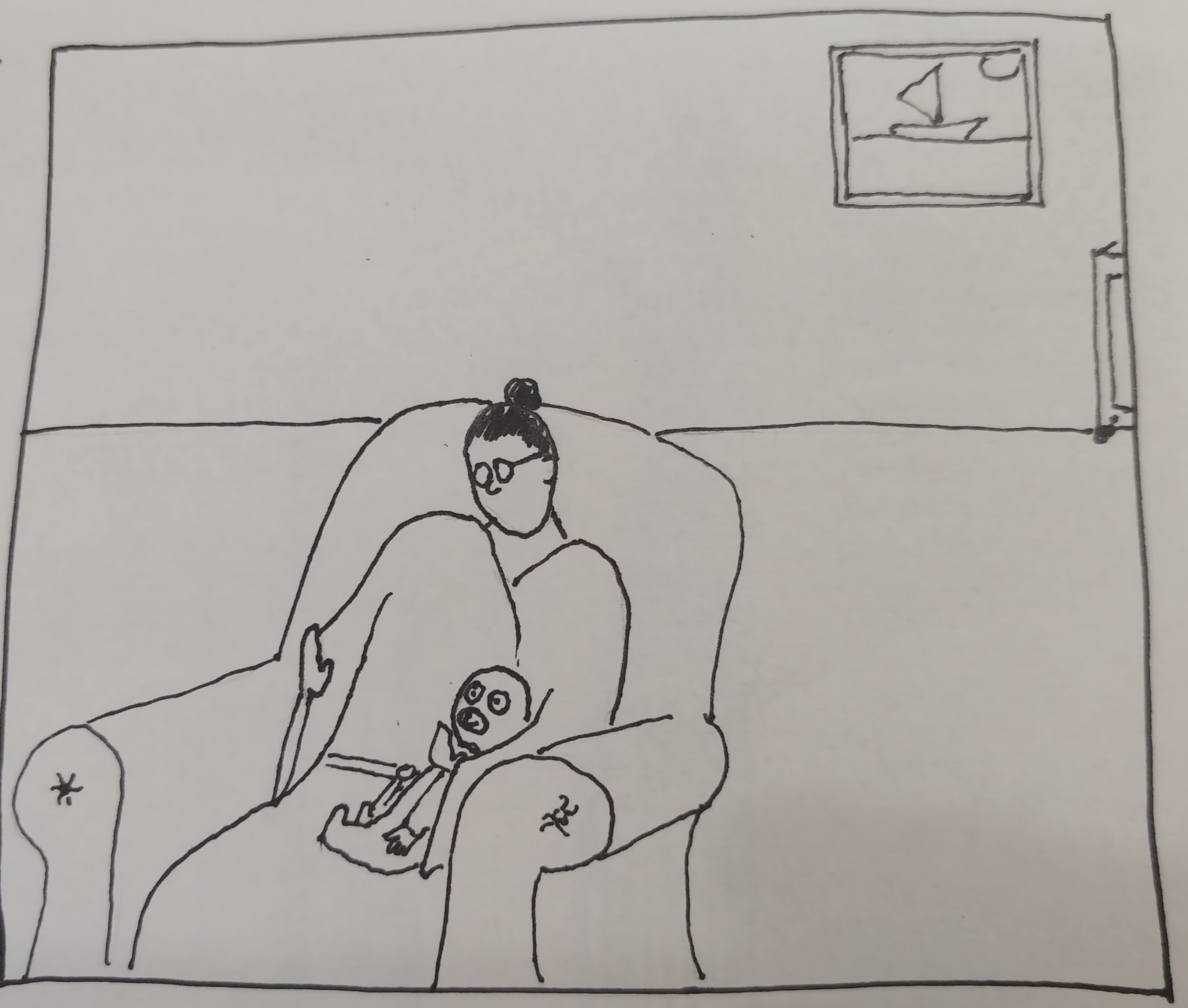
She puts away the phone, grabs junior, and starts the activity.

The child is with mom, they're happy. The baby is watching mom and beneath the surface...

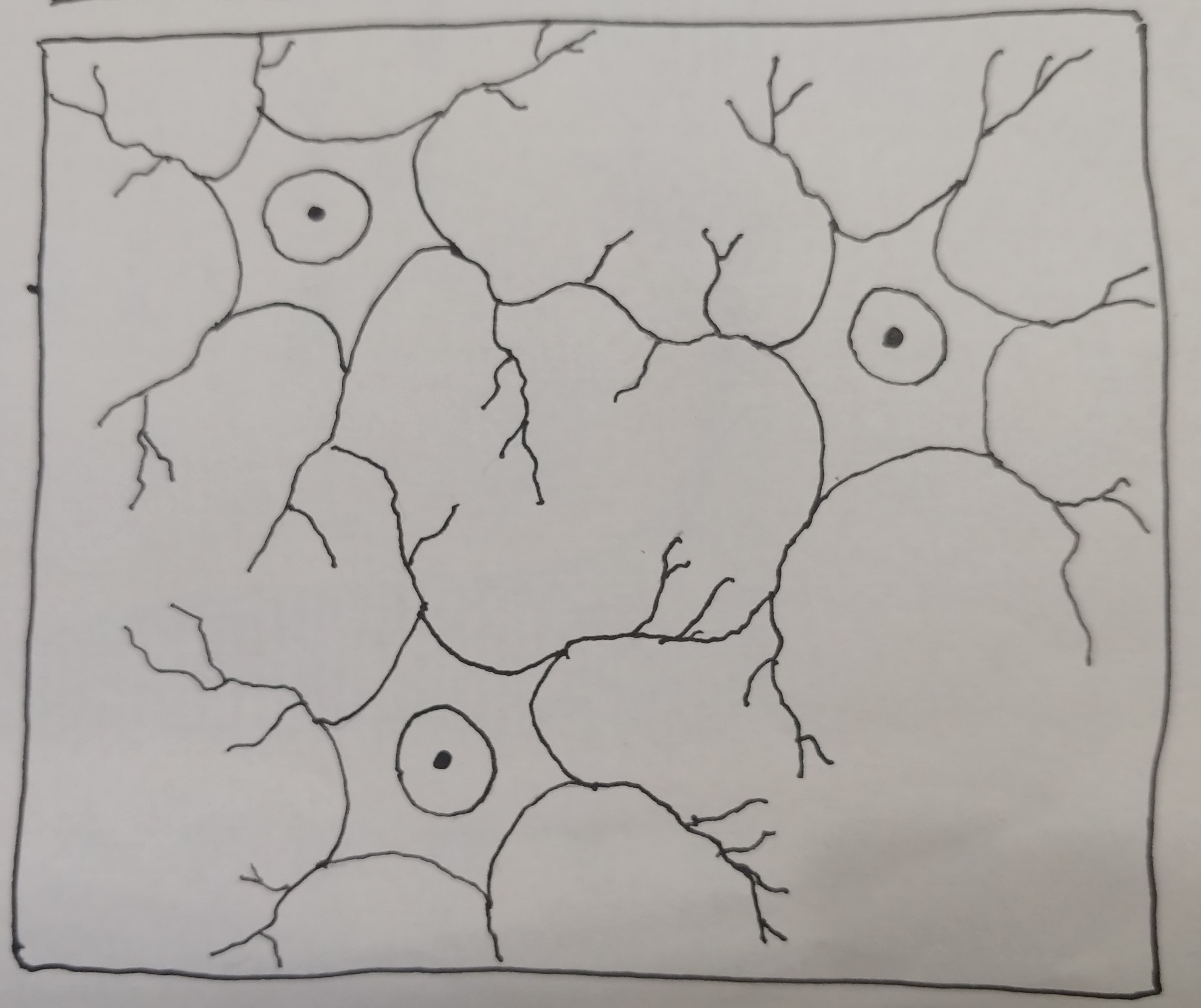
...the baby is making connections, neurons are firing.

Many years pass, but Mom and junior continue learning and practicing and a seed has been planted: the love of music.

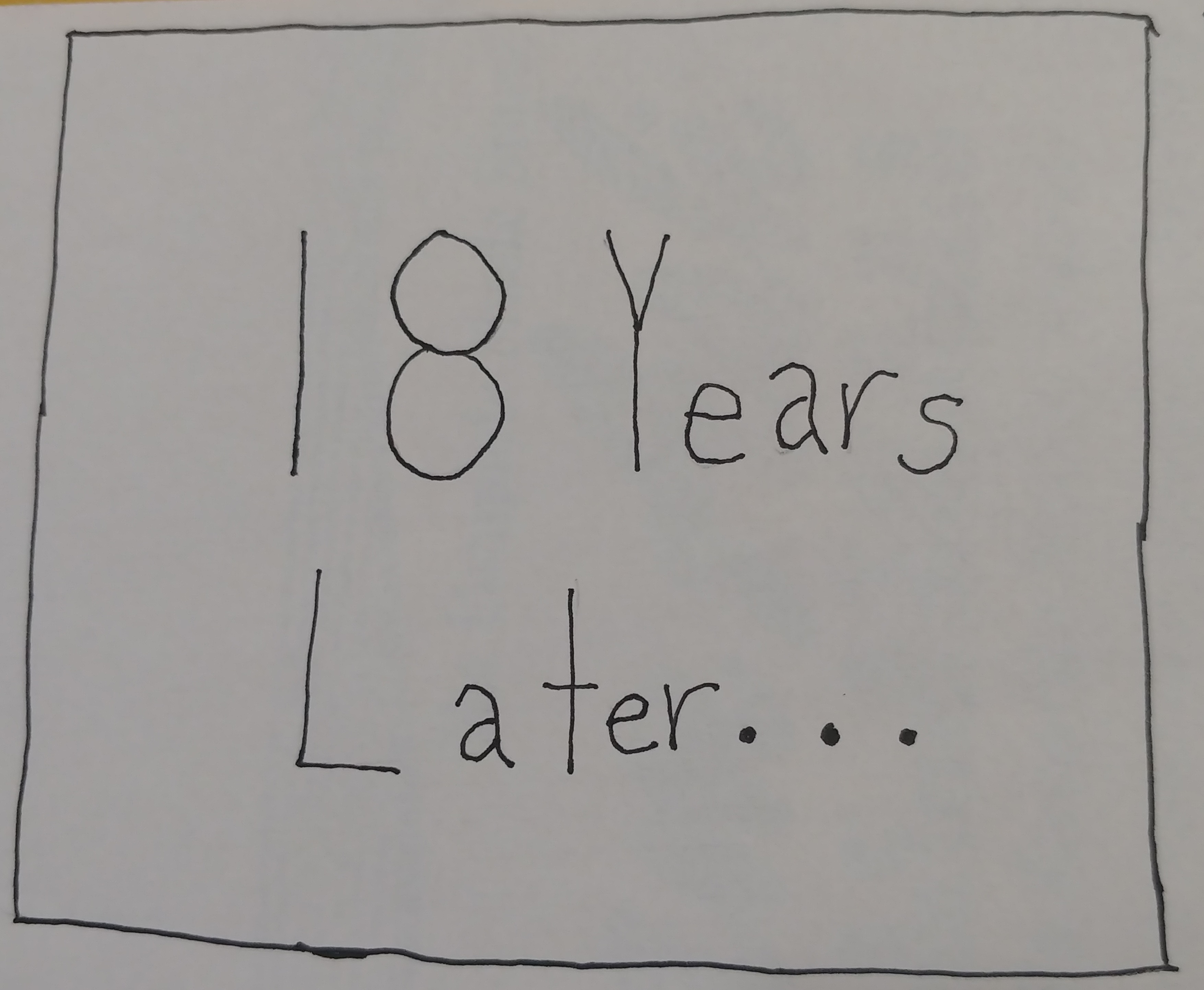
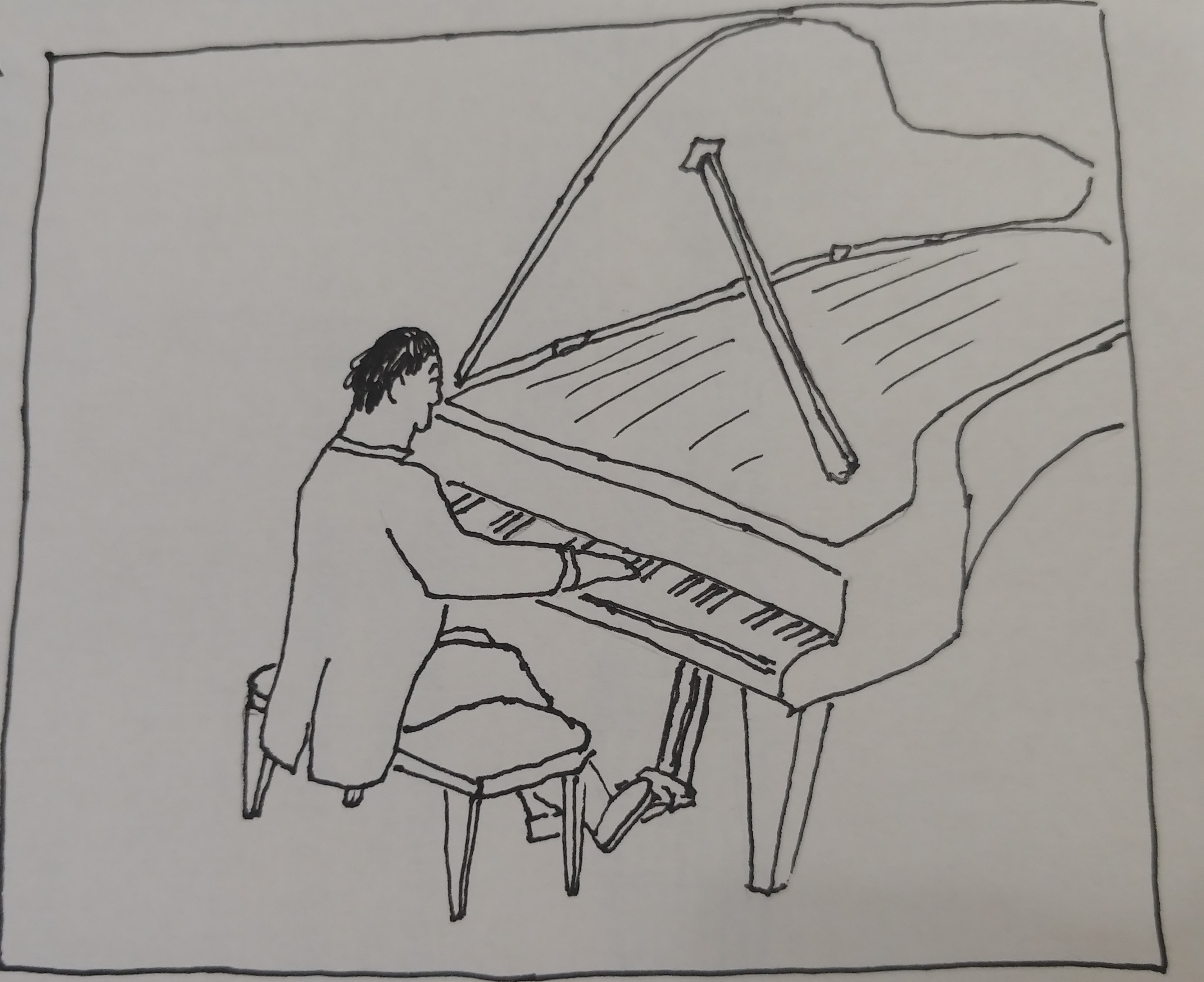
Fast forward eighteen years to catch up with that same baby and there he is, a concert pianist, up on stage. Mom is so proud.
So we have here a house in the suburbs. The white picket fence, the tire swing in the back yard...
...and inside is a new mom and her baby.
She gets a notification on her phone asking if she's got a few minutes to complete today's activity
She does, so she starts the lesson. It's about clapping in time.
She reads what she's doing, she watches the demonstration video. It all makes sense.
She puts away the phone, grabs junior, and starts the activity.
The child is with mom, they're happy. The baby is watching mom and beneath the surface...
...the baby is making connections, neurons are firing.
Fast forward eighteen years to catch up with that same baby and there he is, a concert pianist, up on stage. Mom is so proud.
Roles and Responsibilities
On this project I was flying solo. I completed all of the research, did all of the sketches, drawing, wireframes, prototyping, and testing.
Users and Audience
The primary users were women, pregnant with their first child. They were determined from the research to be those with enough desire and free time to consider such an app.
Our secondary users were women who already had young children. They weren't my primary users since the lack of time would make them less likely to try to start using the app.
Scope and Constraints
The project aimed to create a version 1.0 prototype of an application of an app that could teach those basic concepts to the parents in a welcoming, visually appealing, and usable form.
From beginning to end, the project lasted 23 days. With a budget of zero dollars.
Discovery and Research
So I started the research phase by looking into existing music programs and also a few non-music programs. A few of the notable ones included: Baby Einstein, Nuryl, Little Musician, Muzzy, Baby Sign Language, and others.
I completed a SWOT analysis on about eight of these programs and found that most of them were based on passively teaching children. They would have the child watch the TV, watch the tablet, watch the phone, and pick up the skill in that way.
Additionally, many of the programs seemed to be buggy and like the design hadn't been updated in several years. Outside of the Google Play store, it was difficult to get reviews as almost all of them seemed to come from affiliates.
Survey
So I launched a survey, ten questions, to try and understand how the market felt about these programs, how they felt about teaching their children music, and a bit about child-rearing in general. The survey was posted on Reddit, Facebook, Discord, Slack, some survey trading sites and beyond. I chose to make every question optional in the hopes of getting as many answers as possible and minimizing people ejecting from the survey. In total, over the course of a week, I received fifty responses.

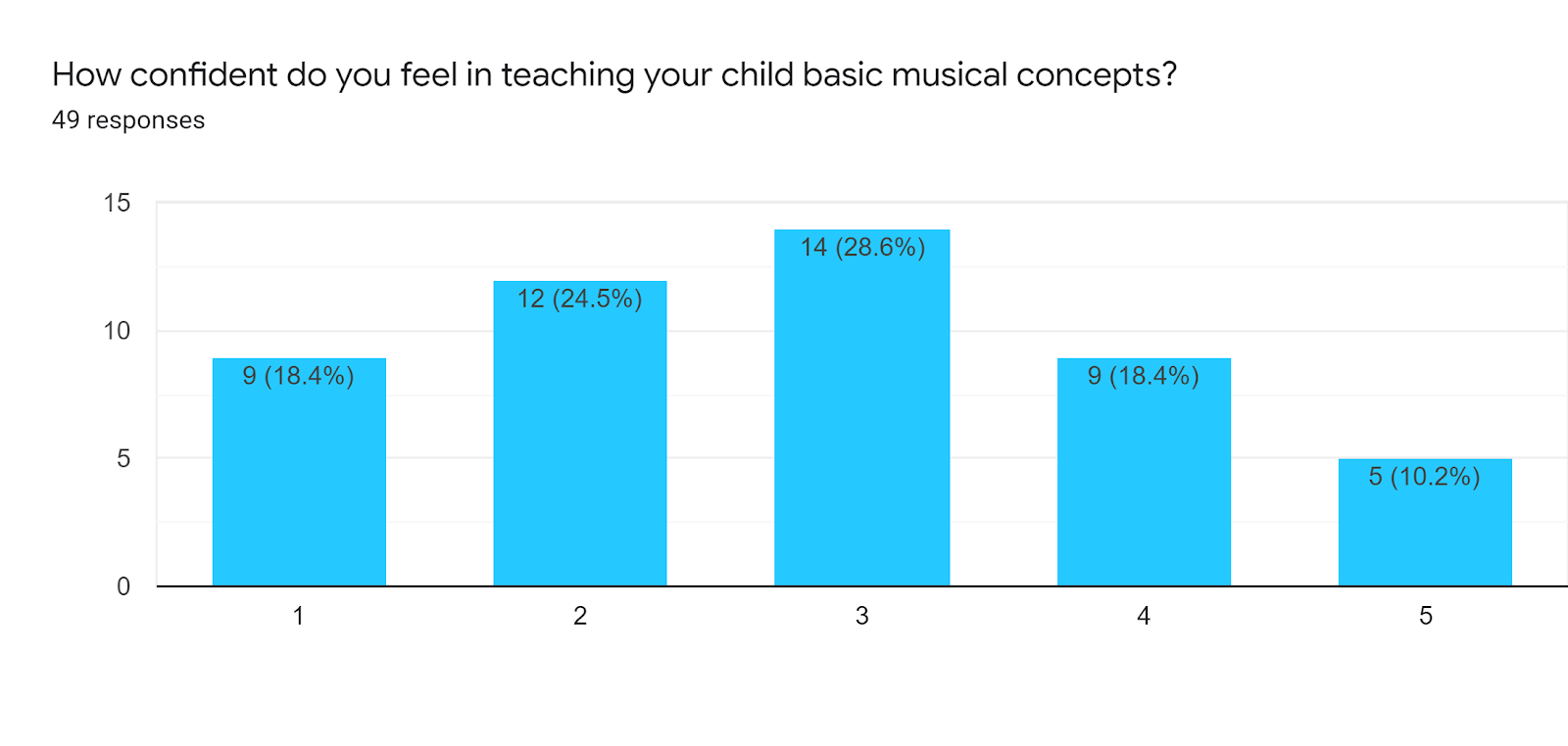
Only ten percent of respondents felt completely confident teaching their children basic musical concepts. Most trended on the neutral to uncomfortable side.
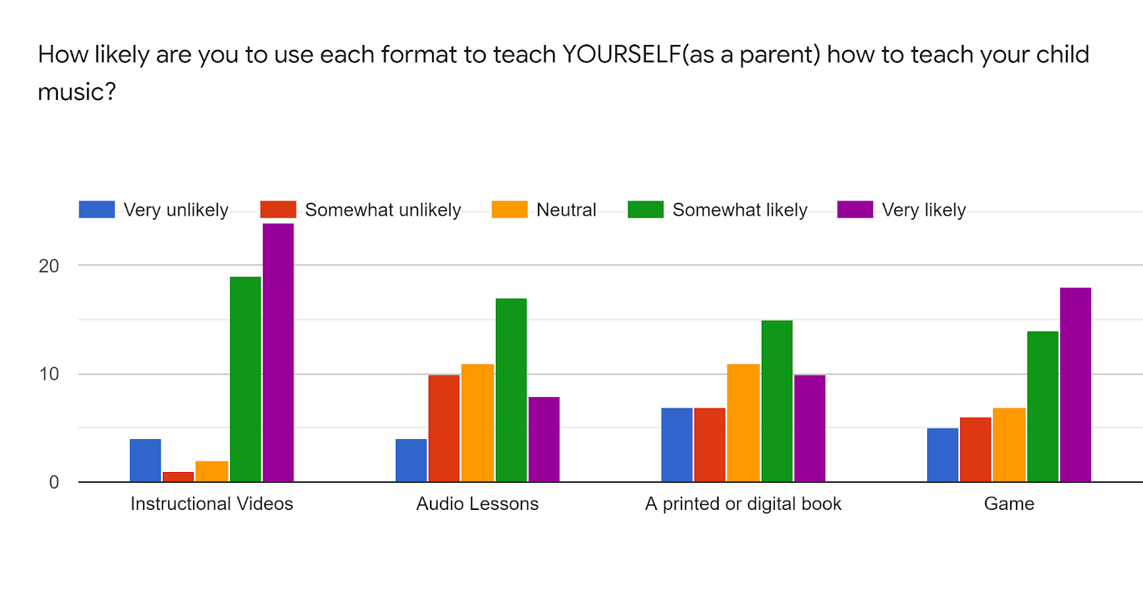
Checking into what format parents would prefer, Instructional Videos came out ahead. Games were well represented (but didn't fit with my desire to have an app that you put away). As an avid reader, I was also disappointed that the physical/digital book wasn't better represented., also in the North End of Boston.

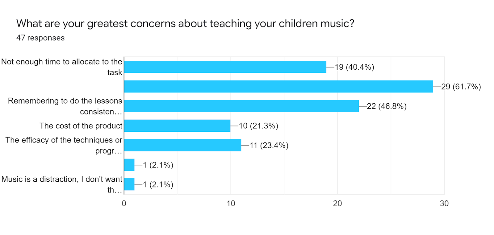
Here we see the greatest concerns that they have about teaching their children music. Number one (not pictured thanks to Google Forms) being a lack of their own ability to teach their child music. Followed next by remembering to do the lessons consistently (so we wanted to make sure we added notifications), and not having enough time to dedicate to doing the task (so we wanted to keep each individual lesson short).
The bottom two write-ins are: the short attention span of children (further encouragement to keep each lesson short) and one jolly fellow who feels music is a distraction and they don't want their children bothered with such trivialities. (That person is not in our target audience)
Finally, we had over a quarter of our respondents say that they would begin teaching their children music from the time they were born and almost 50% saying that they would do so within the first years of life. This is definitely our target audience.
Personas
I created two personas.
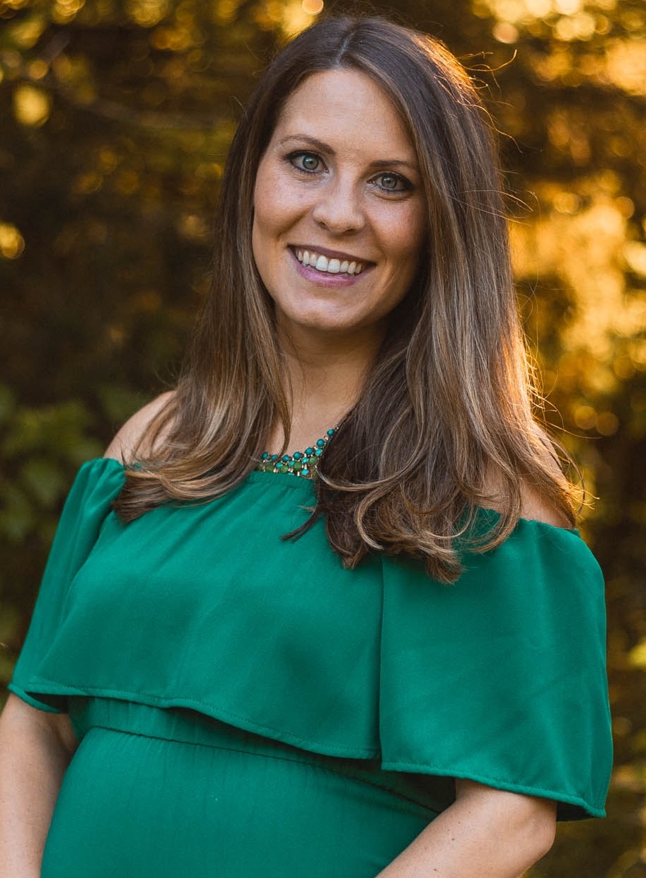
So Amy is preparing to have her first child and although she’s excited she’s also worried about not being prepared. There’s so much information about critical windows and she’s been reading about how important music is to a growing brain. She doesn’t really know much about music and isn’t really confident about teaching it without guidance.
Her goals:
• Find some kind of program or set of steps she can follow
• Sort through all of the information and misinformation surrouinding music
• Find something that can be incorporated into a regular routine.
• Have something that would be fun for her child
Her frustrations:
• Contradictory data (e.g. the Mozart effect, can perfect pitch be taught, etc)
• Music terminology is confusing and she doesn’t have time to sit down and learn to play the banjo right now
• She was forced by her parents to play violin as a child, it wasn’t fun, she quit, but regrets that decision
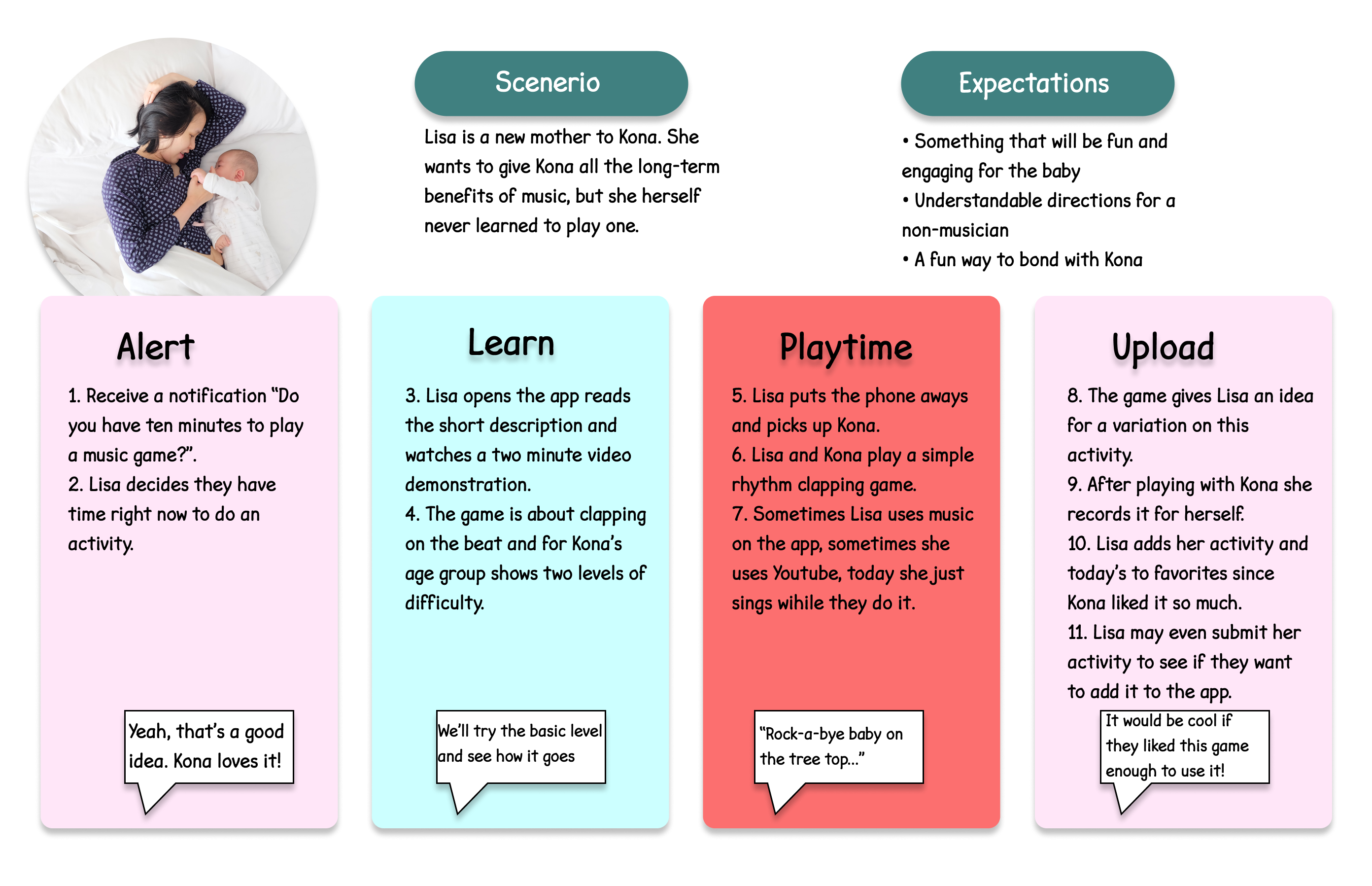
The second persona is Lisa. Lisa is a new mother. She is busy, tired, but doing well. She enjoys singing and playing music for her daughter and her daughter likes it too, but with everything going on in her life, she often doesn’t remember to do any focused musical practice (although she considers it valuable).
Her goals:
• Find quick and engaging lessons. Time is short and so are attention spans
• Something that they can share and even learn together
• Something that doesn’t park the kid in front of a screen
• Simple enough to understand it (as a non-musician)
Her frustrations:
• She never learned an instrument, so she doesn’t know how to teach it to her own child
• Often the day has gone by without remembering to practice
• Children’s music is fine, but why can’t it be something they both enjoy
Journey Mapping
We sent Lisa through a journey map, as she is the one with a child, to see how she would interact with the prodigy app.
Empathy Mapping
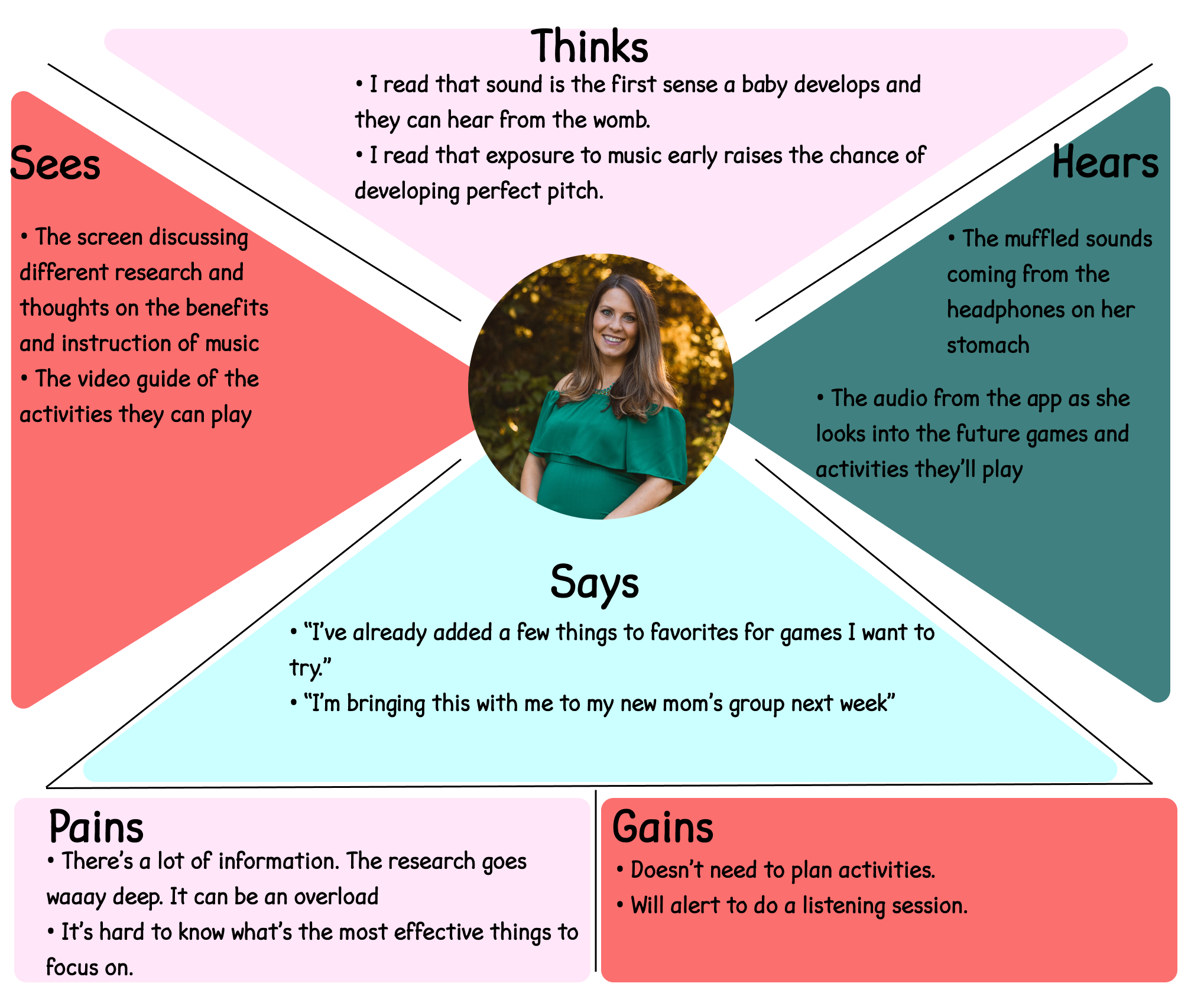
For Amy, I opted instead for doing an empathy map. It took most of the afternoon, but I now completely understand how it feels to be a pregnant woman. (kidding!)
User Stories
User stories: We focused on three user stories:
1. As a parent I want my kids to learn music because of all of the other fringe benefits that go along with it.
2. As an expectant mother I want my future child to have perfect pitch so that they'll have more opportunities if they choose music
3,As a parent and non-musician I want to learn enough music to teach my kids so that they don't miss out on playing an instrument like I did.
These covered the primary tasks that the app needed to be able to handle.
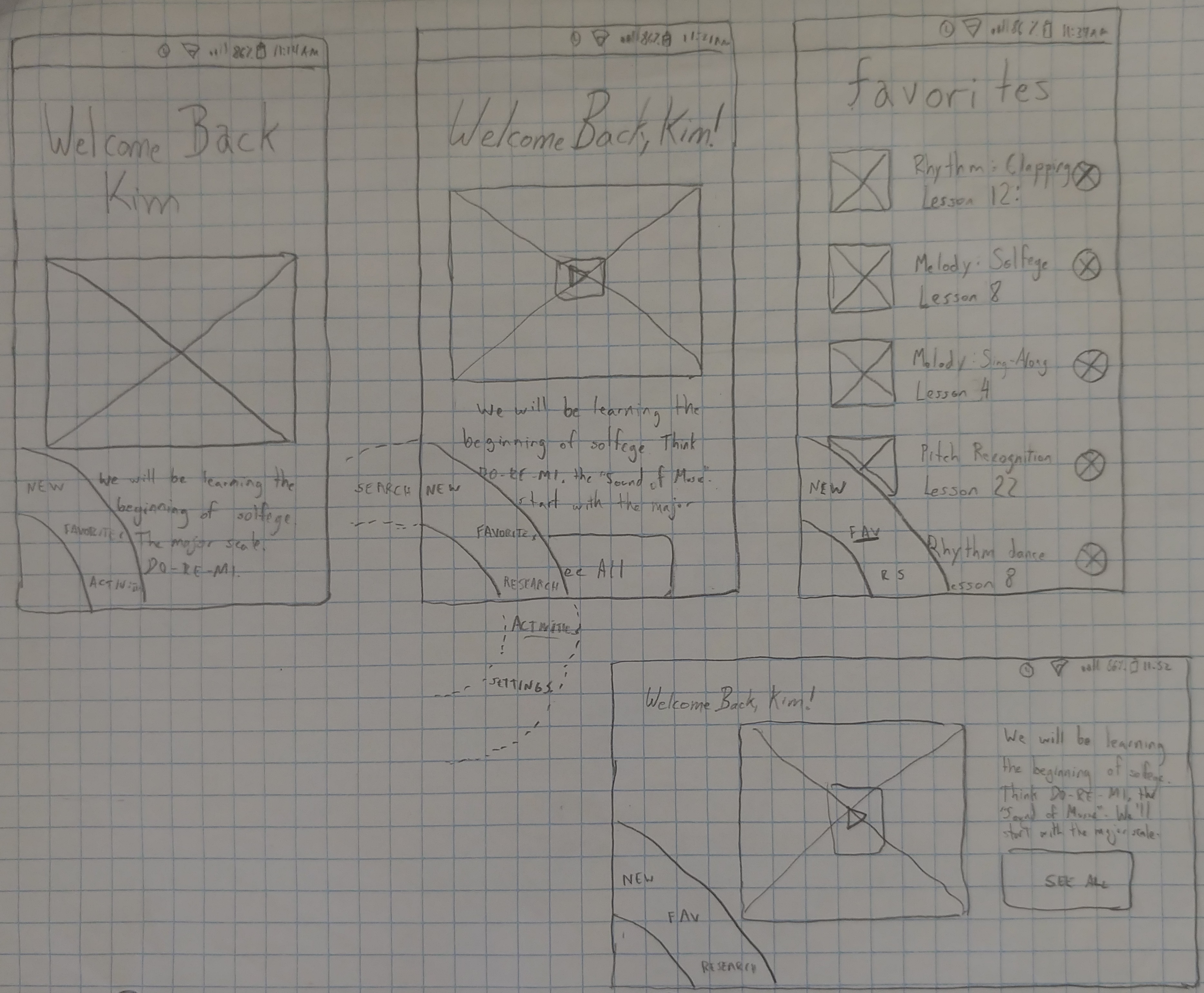
So to begin designing, I started with some Crazy 8s. I tried to be a little crazy and see if I could do something different every time. I had one Tinder-style where you could swipe lessons you wanted to do. I had a strange long nav along the entire left side, I tried having everything on one page with horizontal scrolling for each section.
But the one that most stuck with me was the nav wheel in the lower left of three of the designs, I liked the idea of keeping everything easily accessible to the thumb. I compared it to Instagram where everything I want is up at the top and everything I never use is convenient for me to reach with my thumb,
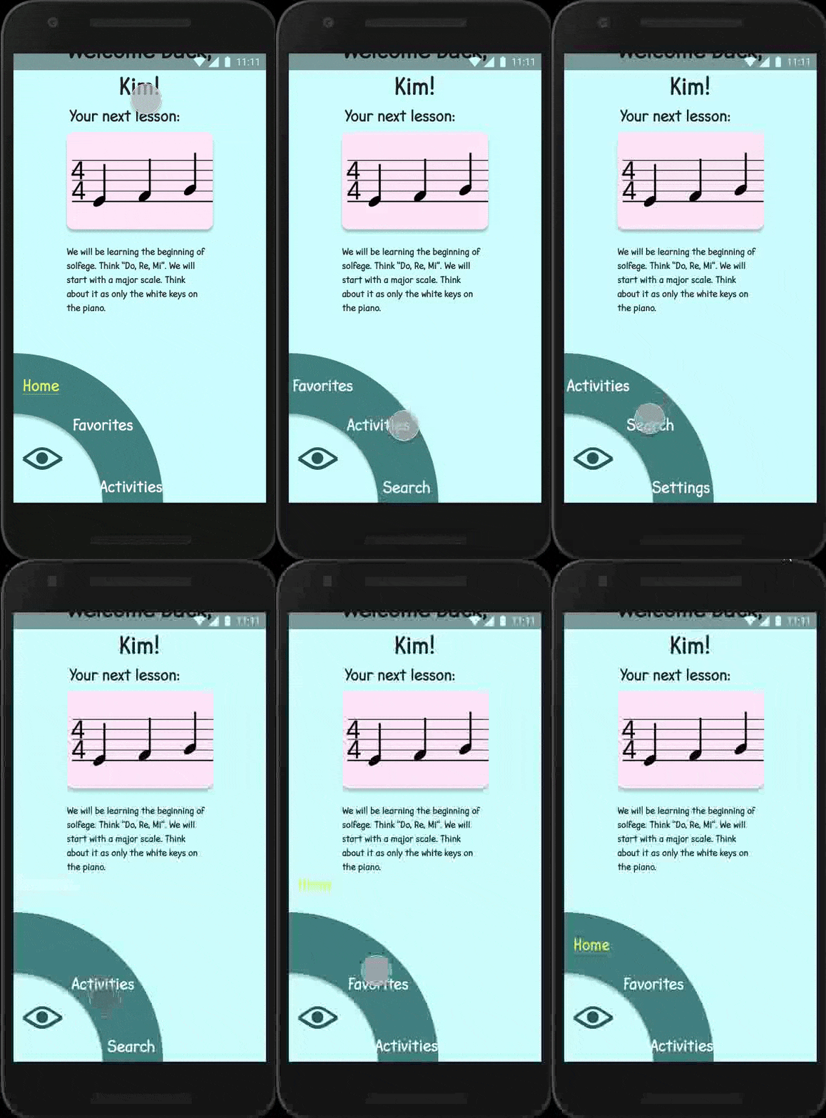
So I took that nav wheel concept and developed it a bit further, and a bit neater. Here you can see (in the dotted line) how links would be available and as you swiped they would become available. Shown here in both portrait and landscape mode.
Wireframing
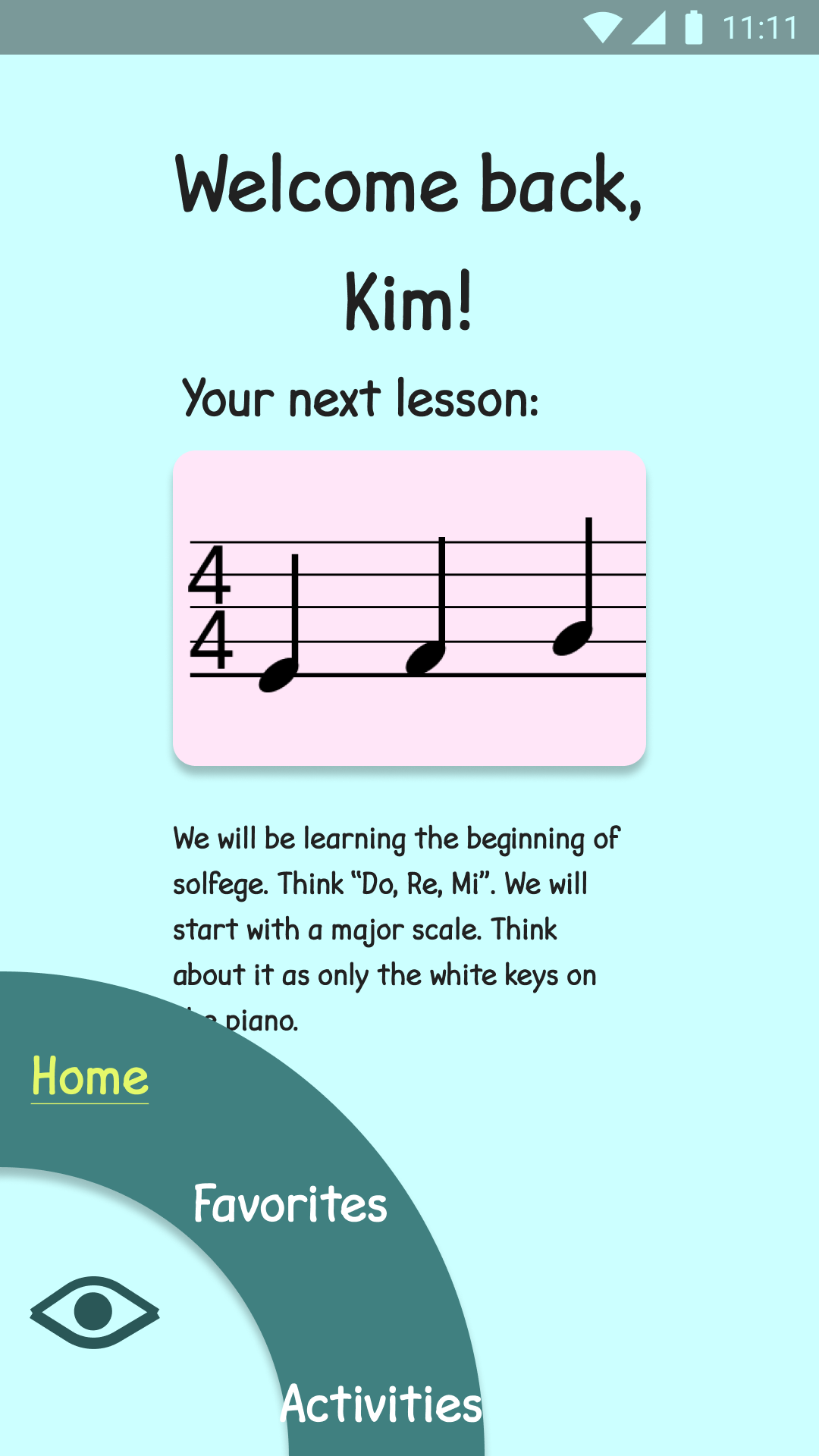
I began to consider branding. I chose the faded blue and pink that you would see in many children's nurseries. I wanted the photos to have a bright child-like energy. The textures where soft watercolors and big poofy blankets. The images are even without sharp corners (got to childproof things I suppose). One of our user testers actually said that everything on the app looked so friendly, they just wanted to squish it.
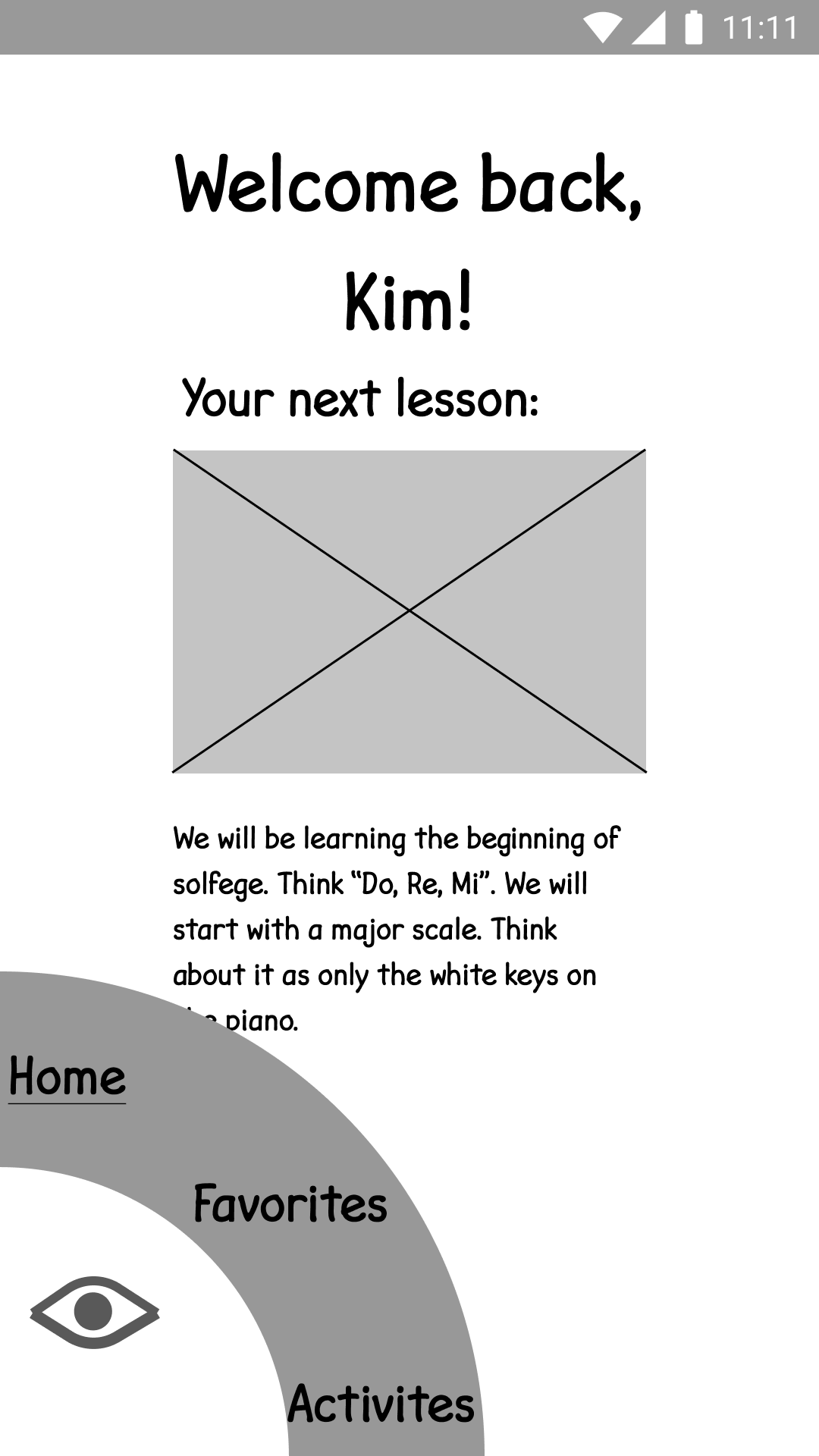
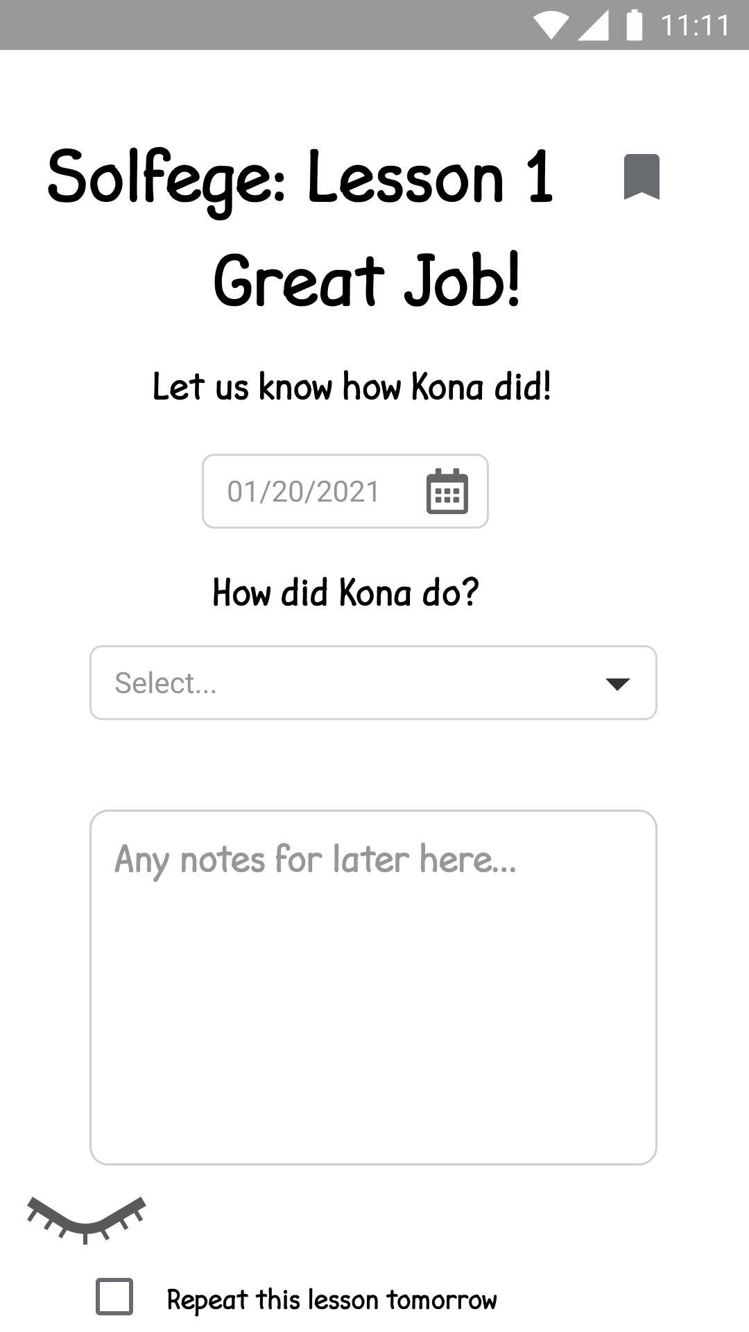
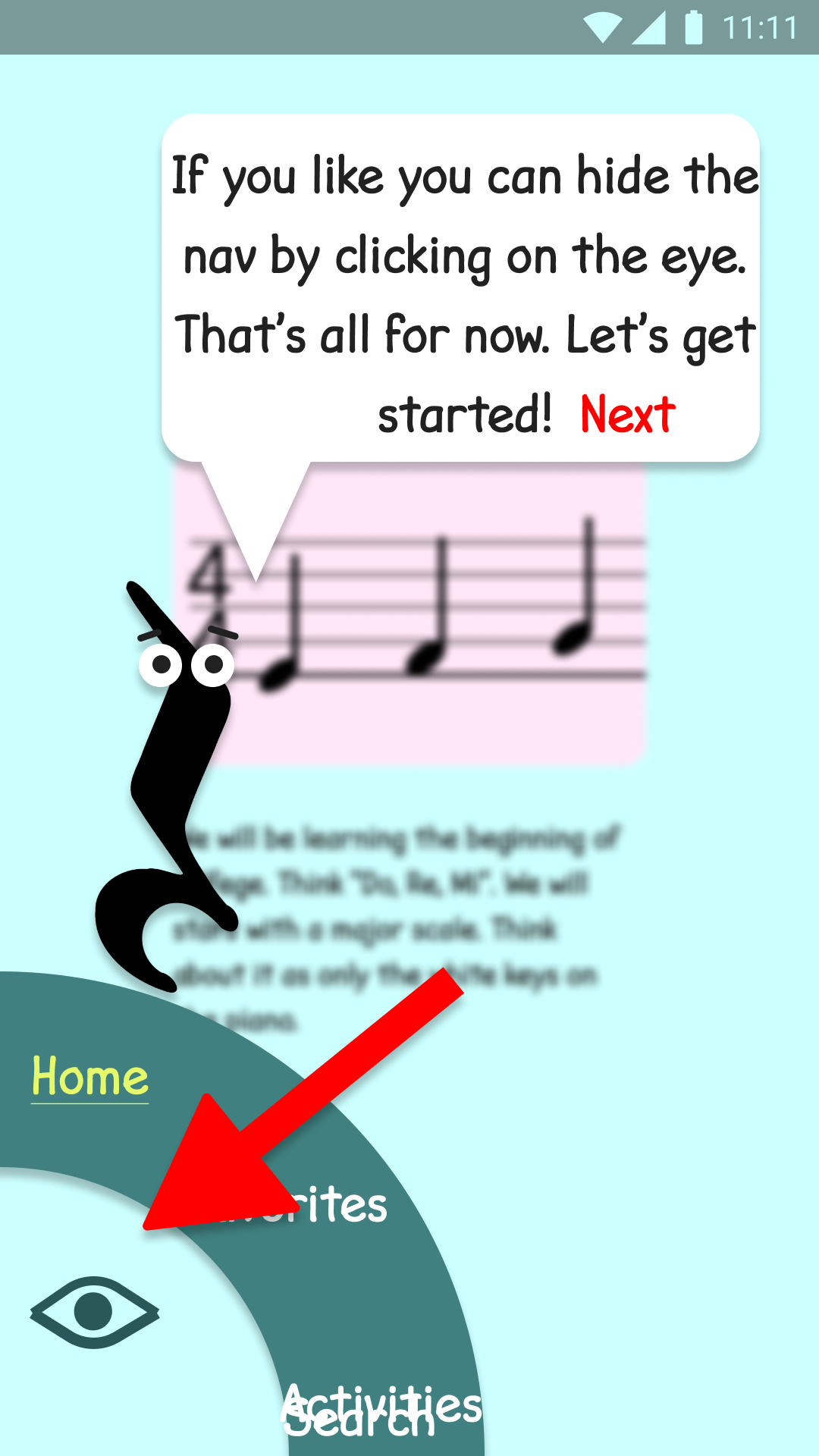
Here you can see my first digital wireframes which I made with Figma, This shows the homepage. I also added an eye that you are able to wink open or closed to hide the entire nav wheel.
Testing and Onboarding
With that complete, we moved on to our first round of testing. The testing was with only one user. He was a bit of a button masher and the kind to try to break things, but that is what we were hoping for.
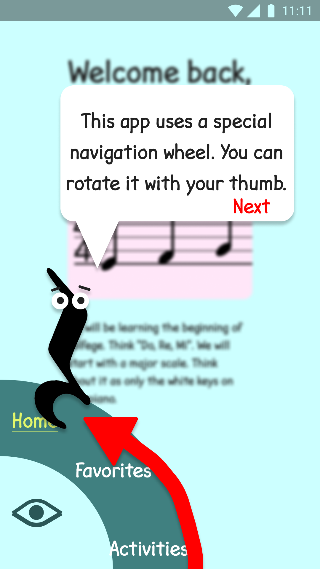
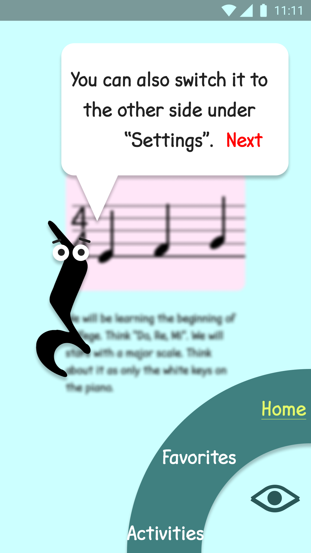
Heartbreak. The user was unable to understand that the nav-wheel was an object that they could rotate. I let them work on it for a minute or so before instructing them that the nav-wheel was rotatable. Following that, they were able to complete the remaining two tasks and finish the test. They were left handed though and appreciated the option to switch the navigation from left to right.
So taking, my licks I went back to see if there was a way to save the nav-wheel. If users couldn't understand that they could rotate it, then the idea was sunk and I'd need to switch to a more traditional nav-bar.
I did the only thing one could do. I added some onboarding instructions. Not only that, I resurrected the friendly Microsoft Paperclip "Clippy". I then turned him into a quarter note rest and gave him instructions to pass along to our new users.
The Battle to Save the Nav Wheel
Armed with fresh onboarding instructions I sent my app back into testing to see if the onboarding would rescue the nav-wheel.
Testing Round Two:
Before we get to that though let's talk about how the rest of the testing went. Firstly, folks loved the onboarding instructions. They enjoyed that they weren't just being thrown into the deep end of the app and expected to figure out how to work everything on their own.
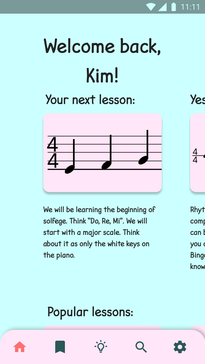
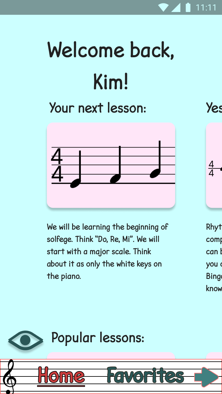
We got some feedback that the Homepage seemed a little empty and that they wanted more information so I added in not just today's lesson but also yesterday's, popular lessons, old completed lessons, as well as a section for news/blogs/etc.
And finally the nav-wheel. Well about half of users took the time to read the directions carefully and half blew through and just got to the homepage. In both cases, users were unable to use the nav-wheel. Part of me wants to blame Figma (since it had quite a lot of problems simulating the functionality), but since no users even tried to rotate the wheel I knew it was sunk. What made it worse was that once they were instructed to use the nav-wheel they became experts and had no real further problem. They said they simply forgot about the nav-wheel instructions. It was outside of their mental model.
So, I went back and changed to a nav-bar. Large font, and fixed to the bottom. I tested it and it tested well enough. All users were able to complete all tasks successfully.

Ultimately, I ended up simplifying the nav further to a single set of standard navigation icons. This would increase accessibility by removing additional complexity and would likely make life easier for the developer.
Final Thoughts
Lessons Learned
With the project now completed (at least this phase of it). Let's look back at a few of the things that I learned and what I'm planing for the future.
- The onboarding instructions were welcomed: My users mostly enjoyed the onboarding instructions. In fact, they liked being walked through the app, a few key features demonstrated, and how best to use the app, rather than be expected to already know and being thrown into the deep end.
- The Quarter Note Rest was a delight: Based upon the Microsoft Paperclip "Clippy" from the early 2000's I used him as my Duolingo Owl to host my onboarding. I recall Clippy being something of an annoyance 15-20 years ago. He has since passed into the realm of nostalgia and is now a delight.
- Onboarding Instructions were not enough: Users were very quick to switch back to their old mental models. Even the users who read carefully through the instructions completely forgot about the nav-wheel functionality as soon as they started testing. Once they were reminded of the wheel they were pros and were able to complete all tasks.
Future Iterations
- So although the research is focused at the beginning of this project it actually never ended. I continue to research daily to try and find the precise niche that I can use to launch it. I don't want to fight head-to-head against the giants in this industry on the things that they already do well.
- That may mean that this project doesn't move forward as an app. Maybe it will become a book, or an audio series, or something else. I think it's still too early to become locked into a definitive direction.
- If this does continue with the app as you see if here, I would like to include the ability to create your own lessons and perhaps share them with other app users around the world and build a community in that way.
- That nav-wheel still hangs in my mind. Again, once users began using it they were able to function quite well with it. Perhaps it could be added in the future under settings as an experimental feature.
I hope you enjoyed this case study. Look for prodigy to be launched officially in 2021!
